
As a small business, your website is one of your most critical marketing assets. It’s also probably the most visited page on your site.
That’s why getting your homepage right is worth the time.
There is power in specificity when it comes to web copy. Each page on your site should ideally communicate one value proposition, have one call-to-action, and speak to one specific reader.
As the broadest page on your website, your homepage doesn’t naturally lend itself to hyper-specificity. The homepage needs to introduce your business as a whole. So, how do you decide what belongs and how to structure the page?
I see so many people fall into the trap of having a very thin homepage that doesn’t say much of anything because they want it to be “clean” and “sleek.” On the flip side, I see others mistakenly put way too much on the homepage, overwhelming visitors with too much info and too many calls to action.
This comprehensive homepage guide will help you wrap your head around homepage structure and the copy you need to help people find you, love you, and say yes to your offer.
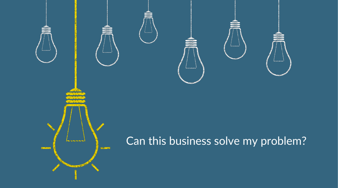
Here’s the important thing to remember. The one question nearly all homepage visitors want the answer to is this:
Can this business solve my problem?
To help people answer that question, you need copy that makes it clear:
Who you are (as in what do you DO and what is your brand’s vibe)
Who you serve (so they know if they’re in the right place)
What they need to do next (so they don’t have to work hard to take you up on your offer)
In this homepage guide, I cover how to answer those questions more effectively through these sections of your homepage:
The Top-Level Navigation
The Hero Section
The Proof
The Overview
The Process Snapshot
The Intro
The Lead Magnet
The Footer
Let’s get started!
What to Include in Your Website Header
The header section of your site displays when you are on the homepage and continues to appear when visitors navigate to other pages on the site.
Be sure that your logo appears in the header and that it links back to your homepage no matter where visitors are on the site. It’s what people expect. If a website’s logo doesn’t take me home, it makes me crazy and feels like something is broken.
I also recommend a button in the upper right corner that links to your contact page or shopping cart—whatever you determine to be your most important action.
I'm not a huge fan of pop-ups on a site, but I do think there's a place for the less obtrusive styles that don't interfere with the visitor's experience. If your site allows for a promotional bar in the header, it can be a great place to highlight your primary offer, a recent promotion, or a featured blog post. Be sure the promo bar copy is short and includes a link to help visitors take action.
How to Structure Your Website’s Main Navigation
A site’s main navigation typically appears across the top of the page within the header. On mobile sites, the navigation often collapses to display as a hamburger menu (three stacked lines that expand when clicked).
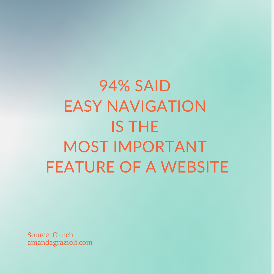
Navigation has a huge impact on user experience and SEO. In a study by Clutch, 94% of respondents said that easy navigation is the most important feature of a website. It’s so important that I’m going to spend a little more time on it even though it isn’t even exclusively part of your homepage.
This main navigation bar of your site should help visitors quickly find the information they need. The pages won't be the same for every business. Your first job is to consider which pages your visitors will be looking for and offer easy access. Diving into your site analytics and other customer research can help with this task.
You want to name your top nav pages in a consistent way. Decide what type of naming structure will best serve your audience and content. The two most common structures are:
Object-Based: This is the most commonly seen structure. Object-based navigation titles use nouns (at times with adjectives) to describe the contents found on the pages or collections of pages in your navigation bar. Examples of object-based navigation titles include: "Bookkeeping Services," "Candles," or "Cooking Classes.
Action-Oriented: This structure uses verbs to indicate where people should go based on what they hope to accomplish. Examples of action-oriented navigation titles include: “Give,” “Apply,” “Tour,” and “Shop.”
If you are a small business or entrepreneur, try to keep your main navigation menu compact with no more than four to seven pages. Research has shown that our brains can only hold a certain number of pieces of information at once. Don’t waste a nav bar spot for your homepage. Remember, the logo in the header should take visitors back home.
Put your most important pages first in the row, least important in the middle, and the contact page on the far right. This tip is also based on human psychology— our brains are trained to recall the first and last things we encounter more effectively.
Resist the urge to get too clever with your page titles in the navigation. Remember, your number one goal is to help people get where they need to go with the least friction and fewest clicks. When possible, use descriptive titles like "Custom Cakes" or ones that people are expecting like "About" and "Blog."
How to Write a Winning Website Hero Section
In the hero section (or heroine section? Is that a change we can get behind?), clarity is king queen. This section is what people immediately see before they scroll. It’s the virtual version of “above-the-fold” copy in a print newspaper.
This section’s job is to help visitors immediately answer that big question: “Can this business solve my problem?” Between the headline (H1) and sub-headline (H2), be sure that you've covered in a clear, concise way: what you do, who you serve, and the value you are promising.
Your homepage headline is a biggie, and writing it can feel intimidating. Here are a few tips to get you started:
Aim for 6–12 words, though the shorter the better within that range.
Go for clear over clever—you want people to understand what you do immediately.
Write it to appeal to a single ideal client. It seems counter-intuitive on a homepage to get so targeted, but the more specific you can get, the easier it will be for people to tell if they are in the right place.
Focus on communicating your most desirable benefit—paint a picture of your ideal client’s dream state.
Do some basic SEO keyword research and try to incorporate your primary keyword or key phrase in your H1.
When it comes to prioritizing bots or humans in your headline, think about your goals. If your goal is increasing site traffic, by all means, invest in good keyword research and make that a top priority. If your goal is to convert people on the page, then keywords are still important but less so.
Every page on your site should have a clear call-to-action (CTA). A call-to-action is an invitation to the reader to take the next step you want them to take. You can have more than one CTA throughout the site, but you should typically choose a single CTA for each page. The homepage CTA needs to be the most important, overarching action you want people to take on your site.
Format your CTA as a button with concise, compelling copy. Be sure that the copy also makes it clear what happens after they click and why it's worthwhile. Good button placements are at the center of the page and the upper left-hand corner. It's also wise to add another button (for the same CTA) at the very bottom center of your homepage to catch people at the end of their scroll.
Using Proof on Your Homepage
Including proof of your product’s or service’s value directly on your homepage helps reassure your visitor that you are legit. Proof can appear anywhere on the page, but a proof bar right below the hero section is nice because it builds that legitimacy fast and ideally encourages people to keep scrolling.
Begin by considering what type of proof would give your target audience confidence that you have the right solution to your problem.
Logos of past and current customers and testimonials are common forms of proof. If you use testimonials, use them wisely to overcome likely objections and to help your reader see that you've helped people like them. You can make testimonials even more powerful by including the reviewer's real, full name and a photo of them. Always get your clients' or customers' written permission to use their testimonials on your site.
Besides social proof, you could also include awards your business has won or short and sweet stats about the results your product or service has achieved.
Communicating Your Core Messaging on the Homepage
Depending on the nature of your business, there is some flexibility in this section. I think of the Overview as a brief highlights section midway down the homepage scroll where you can quickly message that you understand your reader’s problem and have the solution.
Overview copy can be used to communicate your core services, main product categories, or your Big Three. Your Big Three are your top three core messages – the most important things you want people to know about your brand. These messages are often the same as your brand pillars or brand differentiators. They are things that you do better than the competition that set you apart in your market.
When curating your messages to define your Big Three, here are some things to consider:
If someone hears all three of these messages, they should have a well-rounded understanding of what your brand is all about and how you are different than your competition.
Stay away from generic statements like “excellent customer service.” Dig deeper to determine what that actually looks like for your brand and if it’s not unique or memorable, it’s not worth a spot in your Big Three.
Aim to make your Big Three emotionally resonant. These messages need to trigger feelings in your audience by helping them to identify with your brand and see the value you can bring to their life.
Need more help determining your core messages? Grab my Define Your Big Three exercise here.
Writing Your Homepage Process Snapshot
If you are a service-based business, a great thing to include somewhere on your homepage is a quick overview of your process.
I suggest a simple, three-step process snapshot using this format:
Describe that immediate first action you want them to take. (For example, “Book a call to tell me about your current home organization challenges.”)
Describe your core service in a sentence or two (For example, “In our first session, you’ll share your goals for the home. Then in the two additional sessions, I’ll tackle the clutter, make your selected spaces beautiful, and teach you how to keep them that way with simple, realistic systems!”)
Describe the benefit they will get from purchasing your service or product. (For example, “Feel more relaxed, organized, and in love with your home than ever before!”)
What to Include in Your Homepage Intro Section
People want to know you and to know that you share their values before making a purchase decision.
While you should definitely have a dedicated About Page on your site, it is smart to include a (really) short intro on your homepage as well.
This bite-sized intro can take a variety of formats, depending on your brand personality, industry, and the size of your team. One framework I find works for many businesses is:
Photo (of you or your team)
H2 Sub-headline (that indicates this is an intro section)
Three sentences or three bullet points that help introduce you, your values, and your personality.
While this section is about you, you ideally want it to build a bridge between you and your ideal customer by demonstrating your shared experience, struggle, or values.
Why Homepage Lead Magnets Are Key
A lead magnet is a free resource you offer on your site in exchange for a site visitor's email address. Common examples of lead magnets include a checklist, e-book, webinar, or template.

Lead magnets can demonstrate your expertise, build your visitor’s trust in your abilities, and help you build an email list of potential customers.
I mentioned having a single CTA on your homepage is important, but this is the one exception.
A lead magnet serves as what Donald Miller of StoryBrand calls a transitional CTA, one that is lower stakes. It can offer customers a chance to build their journey with your brand even if they aren’t ready to make a purchase or book a call.
What to Put in Your Website Footer
Like the header, the footer will appear below every page on your site.
Include a short, clear sentence in the footer that summarizes what you do and who you serve. You want this sentence to be different from the headline you used in your Hero Section but reinforce the same message.
Be sure to add your business address, phone number, social media buttons, and a current copyright notice. In a B2B website study by KoMarketing, 51% of those surveyed thought the most important missing element from company websites was “thorough contact information.”
Finally, some sites use the footer for additional navigation. If there are pages that don't fit into your main navigation, this can be a place to include them.
Other Homepage Copy Tips
As a final sweep, here are a few more overarching homepage tasks:
Make sure all of your copy is written in your brand voice.
Proofread everything!
Double-check that whenever possible, you frame sentences to lead with your reader.
Be sure that the images you use are legal, sized for the web, and that you include clear, keyword-rich alt image text for them for accessibility and SEO purposes.
Unless they are recapping text that already appears on the page, don't use images that contain text. This is because search engines can't read them, and they may not load properly for all viewers. Instead, always use the text editor for your website to add copy.
Check the appearance of your homepage and all of the links on both mobile and desktop. Remember, most visitors (and all bots) are looking at your mobile site, so legibility, layout, load-time, and clarity all matter extra there!
Are you feeling inspired to uplevel the copy on your small business homepage? I hope so!
Please reach out with any questions and if you are looking for more guidance on your site copy, definitely grab my ten-step Website Copy Audit. This guide goes beyond the homepage to give you ten actionable steps to improve copy throughout your site.